Giving Investors Control: From Manual Bottleneck to Self-Serve Profiles
Information Architecture
Logic Mapping
UX Auditing
Workshop Facilitation
Company
Boulevard Global
Industry
Fintech B2B
Timeline
Aug 2022 - Feb 2023

Boulevard Global (now Liquidise) is a regulated share registry helping private companies manage equity and ASIC compliance. As the sole designer, I led the redesign of a broken, static profile system into a logic-driven self-service experience, giving investors control of their own data for the first time while keeping the platform legally compliant.
Every profile update required manual intervention. The CEO and Head of Product were editing production data directly and hand-filing ASIC forms for routine changes. On a team of 6, this wasn't sustainable.
For the first time, investors could manage their own profile data without contacting the team. The CEO and Head of Product stopped editing production records manually, daily support requests almost completely disappeared, and roughly 10 hours of founding team time went back to building the product every week.
CEO
Head of Product
Product Manager
2 Engineers
1 Product Designer (me)
Workshop Facilitation
Information Architecture
UX/UI Design
QA & Handoff
6 Months
[Concept to Launch]

Preface
Boulevard was built as a secure, digital source of truth for private share registries. To protect the integrity of legal records, the platform was strictly read-only for its two primary user groups: Investors and Company Administrators. On paper, this made sense. In practice, it created a system where users were completely powerless over their own data.
The problem compounded as the user base grew. What started as a careful design decision became an operational liability. Every data change, no matter how minor, had to be handled internally. The team wasn't just managing a product. They were managing a growing backlog of manual requests with no end in sight.
Four systemic blockers emerged:
Zero Autonomy
Users could not edit their own records. A simple address change or name correction became a permanent fixture they had no way to resolve themselves.
The MongoDB Risk
With no user-facing edit functionality, the CEO and Head of Product were directly editing production data in MongoDB to resolve requests. One wrong entry in a live financial database carried serious consequences.
Manual Regulatory Burden
In Australia, every name or address change is a legal event. The team had to manually process and file a Form 484 with ASIC for every routine update, pulling senior leadership away from higher-value work.
Interface Debt
The existing UI had no labels, no visual hierarchy, and no structure. Dense profile data was difficult to scan and understand, which increased confusion and drove even more support requests.
This wasn't an occasional inconvenience. The team was fielding 8 to 10 profile update requests every single day, each one requiring a manual MongoDB edit and, in many cases, an ASIC Form 484 filing.

This case study covers the investor profile card only. I made a deliberate decision to scope this project to the Owner and Contact sections first, since that was where 100% of support requests were originating. The Shares and holdings data below is a separate system that did not require redesign.
" We were scaling the user base but also scaling a mountain of administrative debt. My job was to untangle the logic and design a system that gave users real control while keeping the platform compliant and the data clean. "
UX AUDIT
Before designing anything, I needed to understand why these profiles were so complex. On the surface it looked like a simple edit problem. But the deeper I looked, the more I found hidden logic that the existing UI had never accounted for.
Profiles weren't just "individual" or "company." There were joint owners, beneficiary structures, trust arrangements, and edge cases that varied depending on ownership type. None of this was visible or structured in the current interface. It was all buried in flat, unlabelled data blocks.
Auditing the Existing UI
I mapped my findings against Nielsen's usability heuristics to make the diagnosis objective and shareable with the team. The findings confirmed what everyone already felt: no clear hierarchy, no field logic, no structure that reflected how these profiles actually worked.

Defining the Six Profile Types
I ran a workshop with the Head of Product and PM to map out every investor profile type the platform needed to support. For each type we identified what data was required, what was missing from the current design, how ownership structure affected the fields shown, and which fields carried compliance implications. This gave us a shared foundation before a single wireframe was drawn.

Mapping the Full Field Logic
With the profile types defined, I worked with the PM and Head of Product to map every field across all six types in detail. For each field we documented whether it was required for the first release, whether the user could edit it, and how it mapped to ASIC requirements.
TFN was optional for the first release, with a focus on the core details about the owner and contact information and also to save space on the user interface.
This wasn't just a design exercise. It became the single source of truth that engineering, product, and compliance could all work from.

Initial iterationS
Before committing to the full system, I presented an early wireframe to the team to pressure-test the direction. The layout was simple: a flat card consistent with the rest of the platform, showing the investor name, type, address, email, and phone number. Clean and deliberately minimal.

The team responded positively to the direction but the session surfaced three things the first version had not accounted for:
Multiple contacts were needed. Investors often needed more than one contact to manage their holdings.
Contacts needed to be invited directly from the card, rather than going elsewhere in the product.
First invested date and Beneficial status were missing entirely from the display view.
I observed that this layout was also not scalable to accommodate all 6 profile types. Each type would require a different layout. We needed a layout that would scale across all profile types with as few components as possible.
I incorporated all three pieces of feedback into the next version. The single contact row became a multi-contact table with an Add contact action and a Send Invitation link per row. I expanded the Owner section to include First invested date and Beneficial status.

Stakeholders signed off with one final addition: TFN to be included as an editable field for future feature compatibility. This was planned to be skipped initially to save space, but with this design, there is room for one more piece of data.
That feedback loop, from first wireframe to stakeholder response to revised design, compressed what could have been weeks of back and forth into two focused sessions. It also gave the engineering team confidence that the designs they received had already been stress-tested by the people who knew the compliance requirements best.
Design
With the profile logic mapped and the field rules defined, I had everything I needed to redesign the experience from the ground up. The goal wasn't just to add an edit button. It was to build a system that could handle six distinct investor types, enforce the right rules for each one, and make the whole thing feel simple to the person using it.
One Component, Six Profile Types
Individual, joint, and company profiles all needed different amounts of owner data. Beneficial and non-beneficial variations of each added another layer: non-beneficial profiles required an additional Beneficiary section showing the trust or SMSF name and ABN, while beneficial profiles did not.
Rather than build separate layouts for each combination, I used tables for the Owner and Contact sections.

One row in the Owner table handles an individual investor. Two rows handle a joint investor.

Company profiles follow the same structure as Individual with an additional ACN/ARBN field.
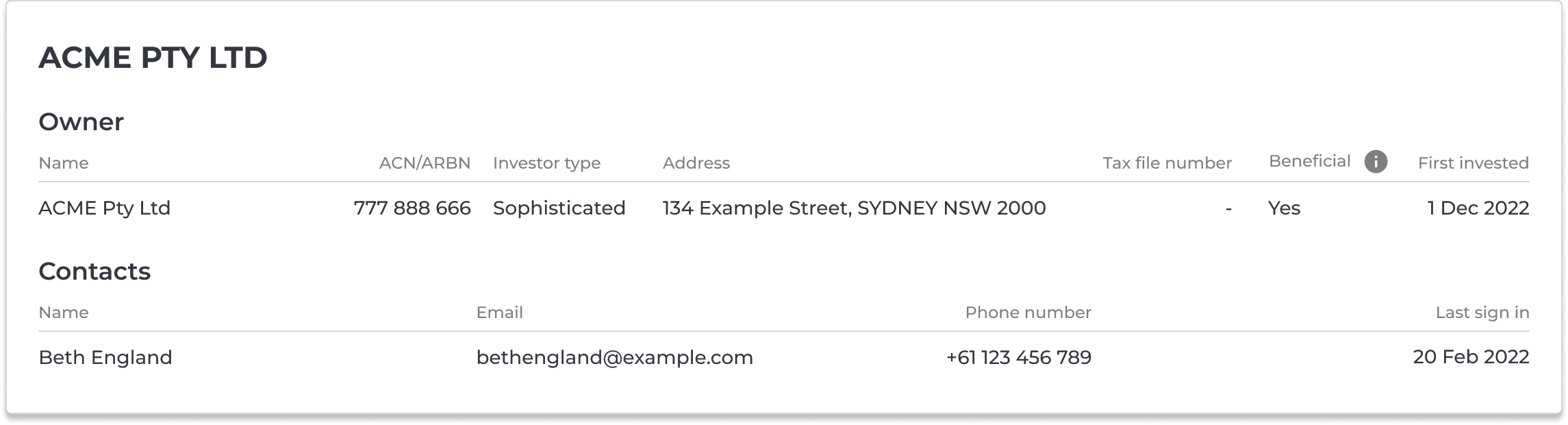
The Beneficiary section visibility was tied directly to the Beneficial status field. When Beneficial is set to No the section appears, and the investor name is automatically appended with "ATF" followed by the beneficiary name, reflecting the legal trust structure. When Beneficial is set to Yes the section does not appear.
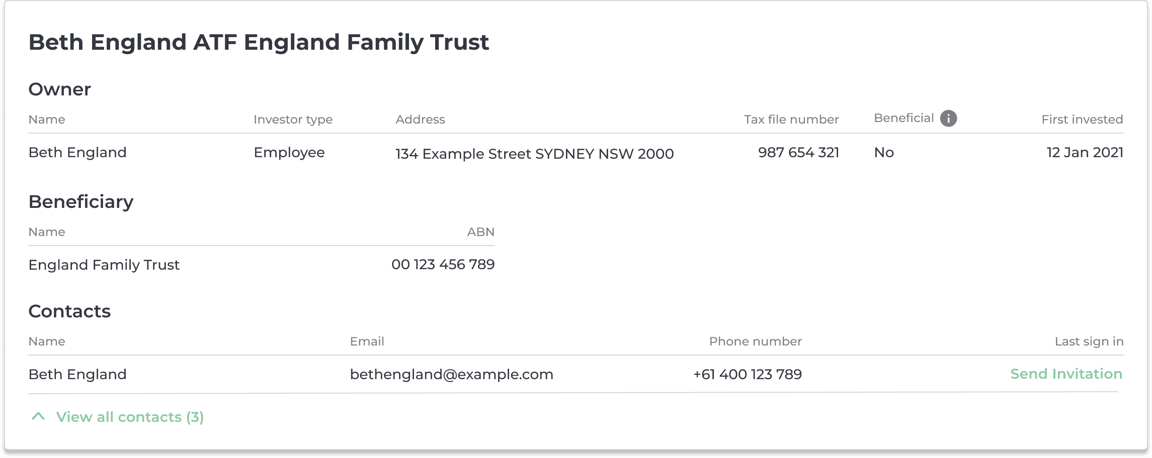
One component, all six profile types. A single fix or update applies everywhere at once.
Solving for Financial Jargon
During internal walkthroughs, terms like "Beneficial Status" were stopping users in their tracks. Rather than simplify the language and risk losing legal accuracy, I introduced the platform's first tooltip component.
Users could get an on-demand definition without leaving the flow. This addressed a real risk of abandonment in a context where confused users had no option but to call support.

Role-Based Editing
The edit form had to handle a fundamental tension. Investors needed enough control to update their own data without creating compliance risk, while admins needed full access to fields investors should never touch directly.

I solved this through field-level role permissions. Fields tied to legal ownership status appear as read-only for investors with a tooltip explaining why they cannot be changed. When an admin opens the same form those fields become editable.

The same edit form served two different users without needing two separate designs. The structure communicated access levels without the system needing to explain them in words.
SHIPPING AND IMPLEMENTATION
With dozens of field variations and compliance rules baked into every profile type, a clean handoff wasn't optional. If engineers misunderstood the logic behind even one profile type, the compliance rules would break silently and nobody would know until a Form 484 was filed incorrectly.
Closing the Loop with Engineering
I ran a dedicated review session with the engineering team before a single line of code was written. We walked through the logic together, clarified ambiguous states, and caught two edge cases that would have caused validation errors in production. That session saved us at least a week of back-and-forth during QA.
Organising the Handoff
I structured the Figma files by ownership type across rows and flow type across columns. This meant engineers could go directly to the exact screen they needed without reverse-engineering the logic from a sea of screens. Every state, every edge case, and every field variation was accounted for and easy to find.

Writing the Tickets
I worked with the PM to write Jira tickets for each investor type and user state. Rather than leaving interpretation to the developer, each ticket included the field rules, visibility logic, and expected behaviour for every variation. This reduced the number of clarification requests during the build significantly.

TESTING AND VALIDATION
With role-based logic and compliance rules baked into every profile type, there were a lot of ways this could quietly break. I partnered with the PM and Head of Product to run internal QA before anything went live.
What We Tested
We worked through every investor type end to end, checking that the right fields appeared for the right roles, that form validation behaved correctly, and that editable fields saved accurately.
We also stress-tested the edge cases we had mapped in the audit, joint ownership structures, beneficiary rules, and trust arrangements, to make sure the logic held across the full range of scenarios.
What We Caught
Testing surfaced small but important issues in address formatting validation and access logic for joint profiles.
None of them were critical, but any one of them left unresolved would have created data inconsistencies in a live financial registry. Catching them in QA rather than production was the point.
Outcome
The system launched successfully across the full platform after internal QA validation. Here is what changed
~0
Daily profile support requests after launch
Based on the support team's assessment post-launch, profile-related tickets had almost completely disappeared.
10 hours
Returned to team per week
At 15 to 20 minutes per request, profile admin was consuming roughly 2 hours of the team's time every day before launch. That time went back to building the product.
6
Investor types supported
Individual, joint, and company profiles each in beneficial and non-beneficial variations, with the right field logic and compliance rules built in for each.
0
Manual DB edits after launch
The CEO, Head of Product, and PM were no longer editing production records directly.. The risk of a senior team member accidentally corrupting live financial data was eliminated entirely.
100% Automated
ASIC Form 484 compliance
Name and address changes that previously required manual regulatory filings were now handled by the system. Compliance became a byproduct of using the product correctly, not an extra step.
REFLECTION
This project looked simple on the surface. A profile page. An edit button. But the real work was in the logic underneath, mapping six investor types, defining field rules, and making sure compliance was built into the system rather than bolted on after the fact.
1
Logic before layouts
The most valuable time I spent on this project was before I opened Figma. The workshop with the Head of Product and PM, and the field mapping exercise that followed, gave the entire team a shared understanding of a system that nobody had ever fully documented. That foundation is what made the design, the build, and the QA all go smoothly.
2
Unglamorous work has strategic value
Eliminating a daily flood of manual support requests didn't require a flashy redesign. It required understanding why the system was broken and fixing the structure, not just the surface. The CEO and Head of Product got hours back every week. That's a business outcome, not just a UX improvement.
3
What I'd do differently
If I were to do this again I would have involved at least two investors in the process earlier, even informally. The field logic was validated internally but never tested with the people who would actually use it. Next time I would validate the field logic with real investors before launch rather than relying solely on internal QA.