Building a Design System Without Pausing the Roadmap
Design Systems
Systems Architecture
React MUI Alignment
Process Optimization
Scalability
product
Liquidise
INDUSTRY
Fintech B2B
TIMELINE
Sep 2022 – Aug 2024

ABOUT
Boulevard Global, now Liquidise, is a regulated share registry serving 170+ companies. I joined as its first designer and spent the rest of my time there building it a tokenized design system alone, in stages, while still shipping product.
CHALLENGE
No published library, no shared source of truth, four different modal implementations that didn't even share a header. Every release needed manual review, and every launch came down to me.
IMPACT
Prototyping time for complex features got cut in half, and the engineering team doubled without adding design debt. Zero enforced tokens became 74 across three governed tiers, exported as JSON and manually wired into the React MUI theme.
TEAM
Lead Engineer Engineering team (2 growing to 5) Product Designer (me)
My Role
First designer, sole owner of the design system Design system and token strategy Documentation and engineering handoff Adoption across the team
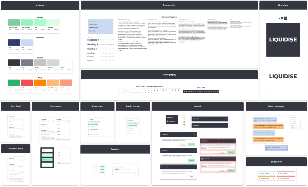
Liquidise Design System on Figma
Preface
I inherited a UI kit that had been running for months without an owner
The product shipped. The design behind it never did, so I became the lookup table.
Boulevard Global had been building for months without a designer before I joined, design shared between the Head of Product and the PM in a team that was otherwise just the CEO and two developers. By then the registry already held records for 170+ companies and roughly $800M in shares, so the stakes were real from day one.

The file I inherited. Styles, components and finished screens in one place with no structure, nothing published, and no way to tell which version was current.
Everything lived on a single page, on a free Figma plan, with two engineers shipping against it. The rest of the file held roughly 100 pages of feature designs, more than the free plan's three-page limit should have allowed, with old pages archived at the bottom that I reused whenever a new feature touched the same ground. There was no design-to-code sync, and every design took days to iterate on, not because the work was hard, but because I was fighting the file itself first.
1
No source of truth
No published library forced a copy-paste workflow. One screen shipped with a totally blank input because nothing forced it to match the pattern used two screens over.
2
Broken components, counted properly
Checking what I remembered against what was really there: 51 button components, 42 input components, four modal implementations across 23 layers.
3
Unreliable styles
One swatch in the brand palette turned out to belong to Apple's iOS UI Kit, evidence the file had been assembled from whatever library happened to be open.
4
Wasted time
Features that should have taken one sprint took two, and with no documentation, I audited every screen before launch myself.
That last point is the one that mattered. I was the only designer and the only checkpoint for every release, and the company was about to move from a static share registry to a regulated trading marketplace with more engineers joining.
Approach
Four stages, because nobody was going to pause the roadmap
Nobody was going to pause the roadmap so I could fix the file. So I didn't ask them to.
Each stage had to deliver something usable on its own. This was never a dedicated project, it was work fit around shipping features the whole time, alongside the ASIC compliance redesign and the early trading prototype that never stopped for the length of it. Cleanup came before tokens on purpose: the textbook order is tokens first, but I had zero organisational buy-in and an active mess nobody had agreed was worth fixing yet. Consolidating the visible chaos, the 51 buttons, the four modals, bought credibility fast.
First, the cleanup
Every style and component reorganised, still on the free plan, just made findable. Roughly two months.
Second, the foundation
Once acquired and on a published library, components rebuilt with auto layout, then a token system went in.
Third, connecting to code
All 74 tokens exported as JSON and handed to engineering, synced into the codebase by hand.
Fourth, staying in sync automatically.
We mapped and agreed on the tooling to automate that handoff, but it never got the dedicated hours to ship.
The first two shipped, third shipped in some form. The fourth always lost to whatever feature was next.
The Build
Consolidate first, give it a language second
Tidy wasn't the bar. Getting there took two moves: consolidate what existed, then give it a shared language.
Auditing the mess
I ran Design Lint alongside Figma's native component and style tools to flag what didn't match, then went through the file manually, page by page, to make sense of what they found. Figma's own panel put the total component count at 178+ before I even started breaking it down:
Component | Count |
|---|---|
Bespoke button components | 51 |
Bespoke input components | 42 |
Modal implementations (none sharing a base) | 4 |
Card or table components (despite the product using both everywhere) | 0 |
The modal was the clearest single example, small enough to lay out in full: four implementations, different padding, different header treatment, none sharing a base. Laying it all out, not just describing it, is what got the cleanup funded.
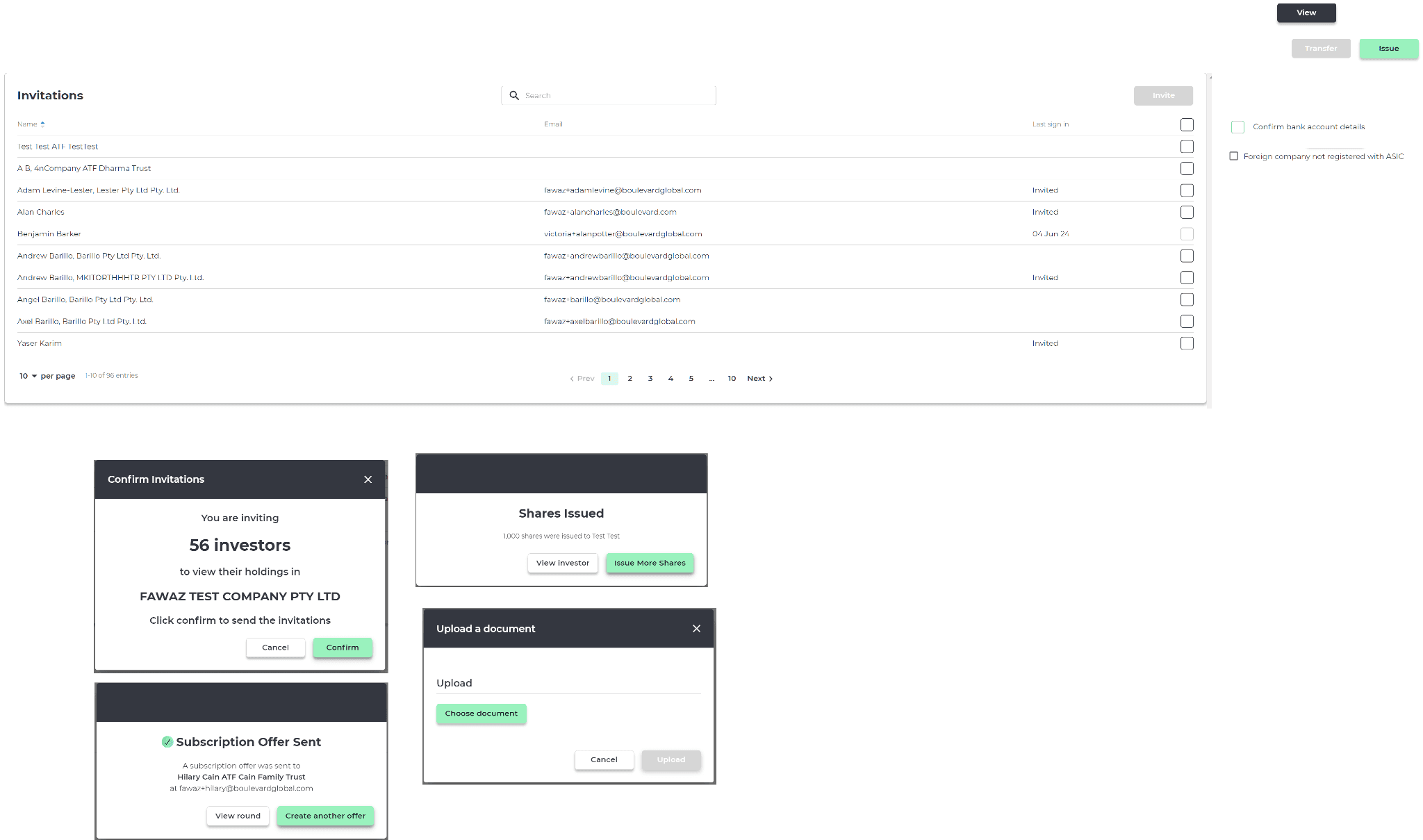
The audit. Different modal treatments from the same product: different padding, different header styles, different button placement.
Consolidating, then publishing
Everything got reorganised into a three-level structure, colour and type and spacing pulled apart from the components using them, even though there was nowhere to publish yet. That took roughly two months and got us to three engineers building against the same page, up from two. Weekly walkthroughs got all three using the library independently, cutting into the manual pre-launch audits I'd been running myself.
Real enforcement came once we were acquired and rebranded to Liquidise: we finally purchased a Figma Professional subscription. The design system moved into its own published library. Product screens lived in a separate file that only ever consumed it and never edited it, and a dedicated Confluence space replaced the blue annotation layers I'd been using as documentation. Five engineers by this point, up from three.

The Confluence documentation, set up once we had a real place to put it.
A shared vocabulary, not a designer's one
Once the library was live, I rebuilt every component on Figma auto layout so buttons expand with their label and modals adapt to content length instead of needing a duplicate. With that running, I went back and replaced every hard-coded value with a three-tier token structure: 74 tokens in total.
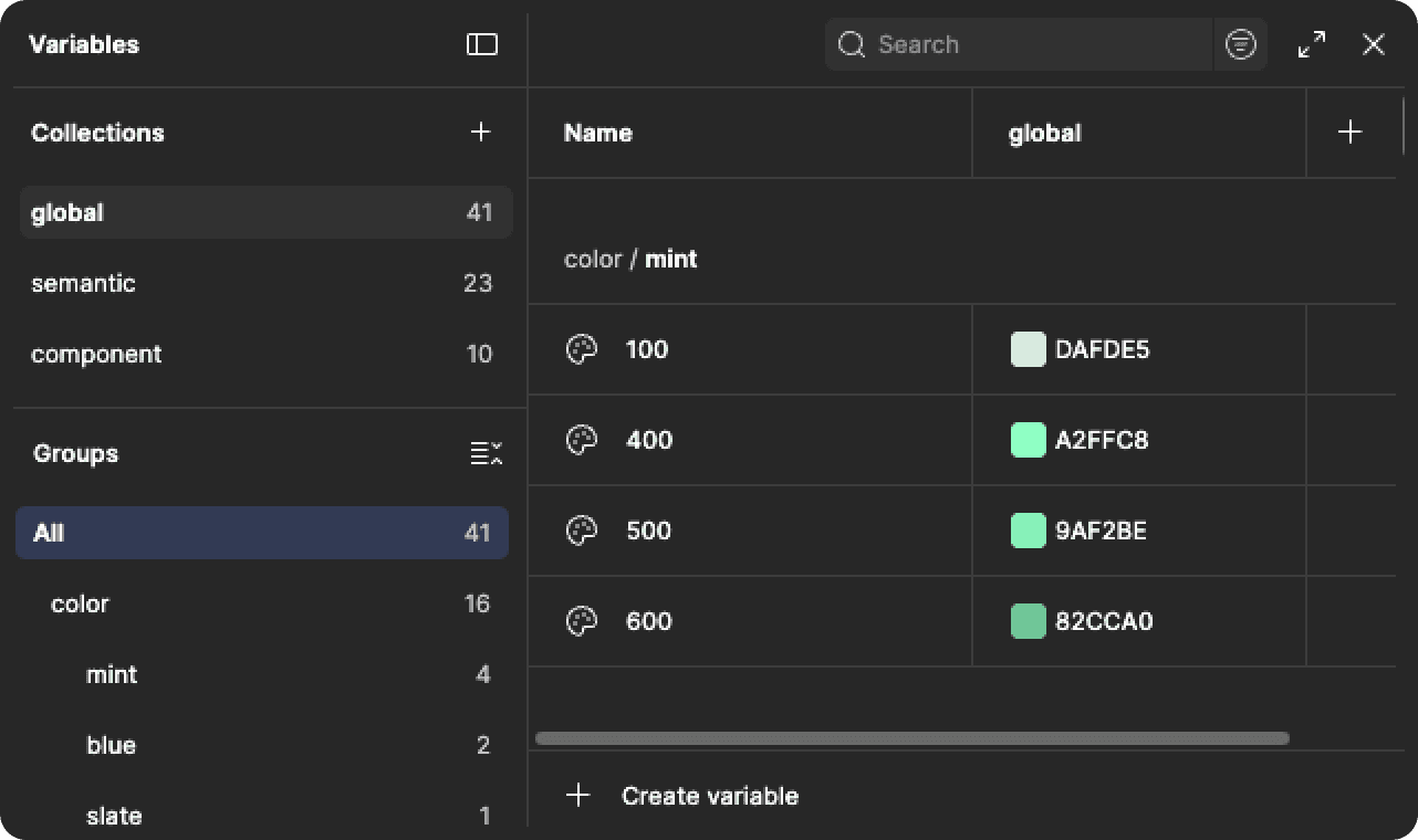
Variables in Figma
I matched the naming to React MUI's own vocabulary, variant, size, palette, so the eventual bridge to code would be a mapping exercise, not a rewrite. brand.primary resolves to a raw color.mint.400 primitive, so a brand refresh is a one-line change at the primitive tier instead of a find-and-replace across every component using that colour.
Card and Table, the two patterns the old file never had a real component for, got one too: Card ships with 8 variants and a content-slot property, Blank, Display fields, or Table, so the same shell holds whatever a screen actually needs instead of being rebuilt per use.
Impact
What changed, and what never got the hours
The workflow changed before the system was finished, which was the point of phasing it.
The bridge to code got built by hand
I exported all 74 tokens as a single JSON file and worked with engineering to keep the codebase in sync with it by hand: there was no build step, no ESLint enforcement, no Storybook parity. The plan for all three was mapped and agreed. It just needed a designer with the hours to pair on it, and those hours went to the trading marketplace instead. The sync stayed manual for as long as I was there. The vocabulary matched, so each round was straightforward, but it was still a person doing it every time instead of a pipeline doing it on its own.
What stayed unfinished
Accessibility was on the roadmap and never got the dedicated time: colour contrast wasn't audited against WCAG, and no component carries a governed focus state. Display shipped as a component, a labelled field with a toggleable inline-edit state for showing or capturing data, but never got a token behind it: its colour and type values are still hardcoded. Iconography ran as two unmerged systems, and mobile never got past a scoped, unbuilt collapsible sidebar. That's the honest distance between what shipped and what a mature system looks like.
This wasn't a project that wrapped once the first two stages shipped, and enforcement stayed manual, by design review, since the automated layer never got the dedicated hours. I kept extending it for the rest of my time at Liquidise, in the margins of whatever feature was next.
Collaboration
A naming decision, not a meeting
The clearest moment of influence wasn't a meeting, it was a naming decision.
Early on I chose token names, variant, size, state, that mirrored MUI's own prop vocabulary. The Lead Engineer picked up on it immediately. A design review stopped being "translate this into code" and became "confirm this matches what you'd already write." When I mapped the JSON export, I worked it through with him directly rather than handing over a spec afterward. He told me where token names would land in the theme file, and I adjusted the naming before any of it got built.
There was never a formal review process, because there was never a second designer to review with. Every component got tested against a real screen before it went into the library, every accepted update went through me, and reviews stayed conversations with the Lead Engineer, not something on the calendar.
"Fawaz is a diligent and innovative designer who bridges product vision and user experience with elegant, intuitive designs. His ability to oversee the entire design system, be readily accessible, and maintain a calm presence was inspiring."

Baljinder Singh
Software Engineer at Liquidise
Reflection
What I learned
Systems are about people, not pixels. Selling it to engineers and writing it down mattered as much as building it.
1
Stage it, or it never happens.
I was the only designer, and nobody was going to pause the roadmap so I could build infrastructure. Four stages meant each one delivered something usable on its own, so when the third and fourth never got the dedicated hours, the first two still stood.
2
A label without a source behind it is not a token.
I found a swatch in the brand palette that traced back to an unrelated iOS icon library, not Boulevard, quiet evidence the file had been assembled from whatever library happened to be open. 74 real tokens later, that kind of drift is structurally harder to reintroduce.
3
Adoption is the work, not the artefact.
Weekly walkthroughs did more for adoption than the library itself. A system nobody opens is documentation.
What I'd do differently: I never measured it. I can tell you the team doubled without adding design debt. I cannot tell you how much faster anything got for engineering, because I only measured my own prototyping time. Baseline timings before the cleanup would have cost an afternoon and made every claim since defensible.